Pure CSS Bouncing Ball Animation
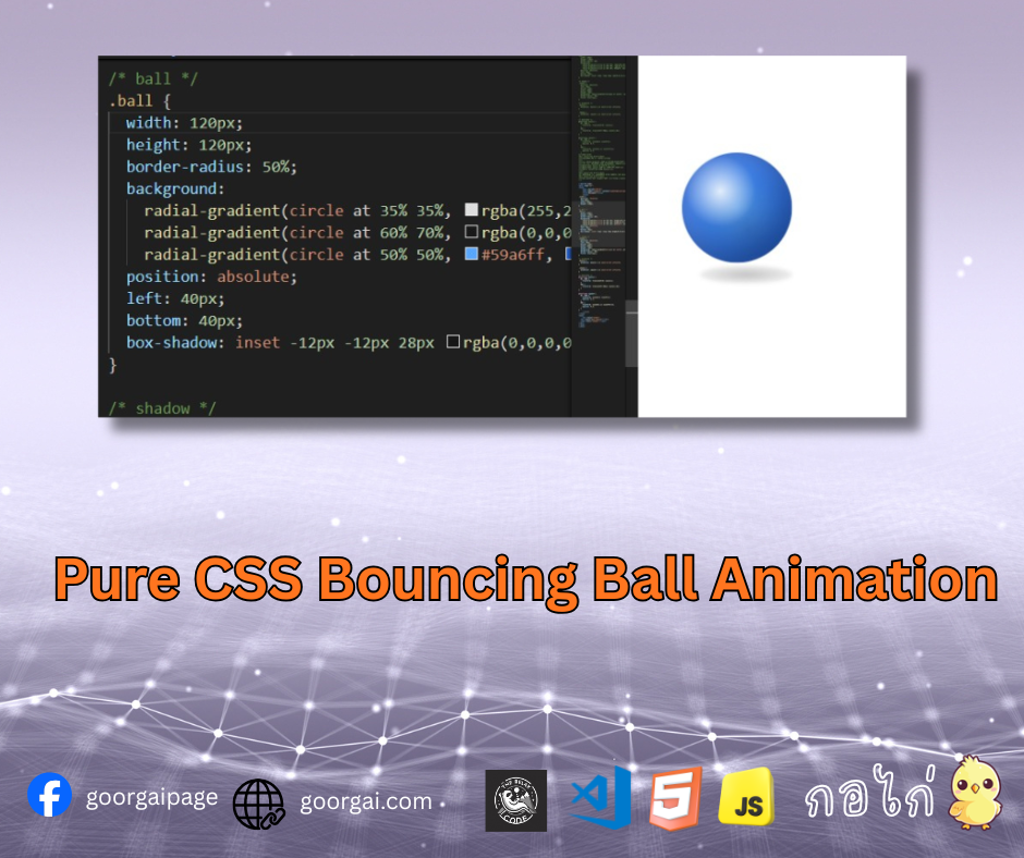
ลูกบอลเด้งที่ใช้ CSS เพียงอย่างเดียว สร้างมิติและความสมจริงด้วย gradient และการเคลื่อนไหวของเงา
ใช้ transform กับ animation เพื่อให้ลูกบอลเด้ง และปรับสเกล/ความทึบของเงาให้สมจริง
แอนิเมชันลูกบอลเด้งที่สร้างด้วย CSS เพียงอย่างเดียว โดยใช้ radial-gradient เพื่อจำลองแสง เงา และมิติของลูกบอล พร้อมเอฟเฟกต์เงาด้านล่างที่เปลี่ยนรูปตามจังหวะการกระโดด ช่วยให้การเคลื่อนไหวดูสมจริงมากยิ่งขึ้น
โค้ด HTML<div class="scene">
<div class="ball bounce"></div>
<span class="shadow"></span>
</div>.scene {
position: relative;
top:100px;
width: 200px;
height: 220px;
}
/* ball */
.ball {
width: 120px;
height: 120px;
border-radius: 50%;
background:
radial-gradient(circle at 35% 35%, rgba(255,255,255,0.85), rgba(255,255,255,0) 35%),
radial-gradient(circle at 60% 70%, rgba(0,0,0,0.2), rgba(0,0,0,0) 60%),
radial-gradient(circle at 50% 50%, #59a6ff, #2364d8 70%);
position: absolute;
left: 40px;
bottom: 40px;
box-shadow: inset -12px -12px 28px rgba(0,0,0,0.25), inset 12px 12px 28px rgba(255,255,255,0.2);
}
/* shadow */
.shadow {
position: absolute;
left: 60px;
bottom: 25px;
width: 100px;
height: 20px;
background: radial-gradient(ellipse at center, rgba(0,0,0,0.35), rgba(0,0,0,0));
border-radius: 50%;
filter: blur(2px);
}
/* animation */
.bounce {
animation: bounce 1.2s ease-in-out infinite;
}
.shadow {
animation: squash 1.2s ease-in-out infinite;
}
/* keyframes */
@keyframes bounce {
0%, 100% {
transform: translateY(0) scale(1);
}
50% {
transform: translateY(-80px) scale(1.02);
}
}
@keyframes squash {
0%, 100% {
transform: scaleX(1) scaleY(1);
opacity: 0.7;
}
50% {
transform: scaleX(1.1) scaleY(0.8);
opacity: 0.4;
}
}- ใช้ radial-gradient จำลองแสงสะท้อนบนพื้นผิวลูกบอล
- เอฟเฟกต์เงาด้านล่างช่วยเสริมความลึก (Depth)
- @keyframes bounce ควบคุมการเด้ง
- @keyframes squash จำลองแรงกดตอนกระทบพื้น
- ไม่ใช้ JavaScript หรือ Canvas
เหมาะสำหรับใช้เป็นตัวอย่างในการเรียนรู้ CSS Animation, Keyframes, และการสร้างวัตถุ 3 มิติแบบไม่ใช้ JavaScript
CSS Tutorial
2025-12-10 01:41:37